How to Add a Scatter Graph to the Patient Dashboard
Completion requirements
Why Use This Function:
A Scatter Graph is useful for tracking relationships between variables like medication dosage and Patient outcomes or monitoring a Patient's growth over time. It helps identify trends, spot outliers, and improve data analysis for better decision-making and quality control in healthcare.
The Contents of This User Manual:
Advanced Settings
Date Interval
Background Image
Data Shown By
X-Axis
Y-Axis
Widget Visible Patient Age Range
Graphs
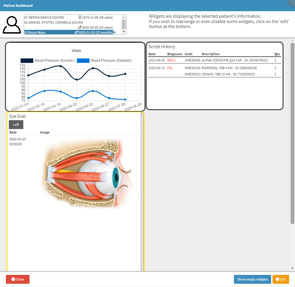
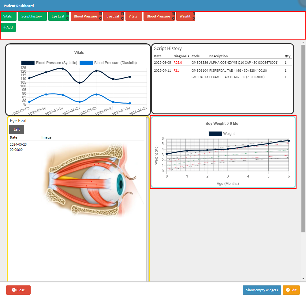
This user manual will start on the Patient Dashboard screen.
For more information on the Patient Dashboard, please refer to the user manual: The Patient Dashboard.
Click on the Edit button.
The Editable Patient Dashboard screen will open.
For more information on how to Edit the Patient Dashboard, please refer to the user manual: Edit The Patient Dashboard.
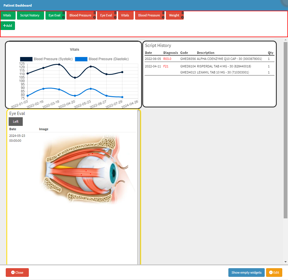
Click on the Add button.
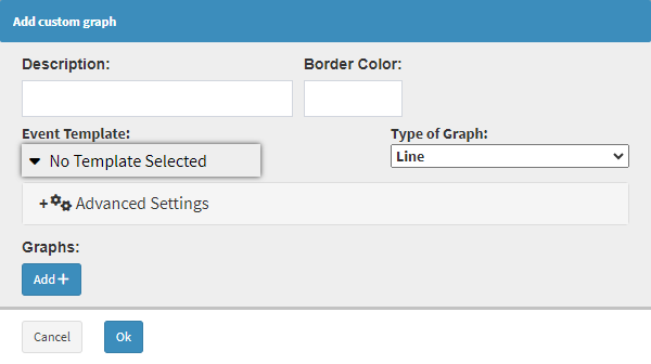
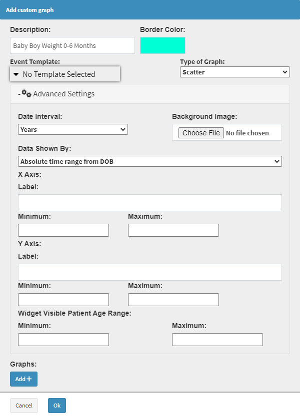
The Add Custom Graph screen will open.
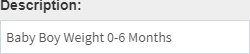
Click on the Description field to Add a Title Name for the Graph.
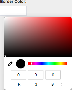
Click on the Border Colour field to open the colour picker.
Select the desired colour from the colour picker.
The Border Colour field will change to the selected colour.
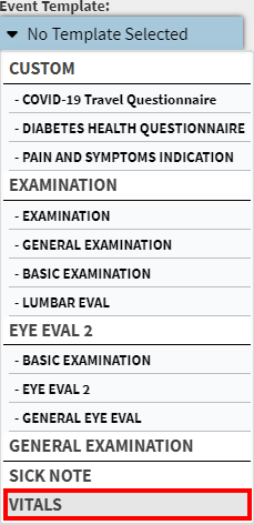
Click on the Event Template drop-down menu to select an appropriate option for the Graph.
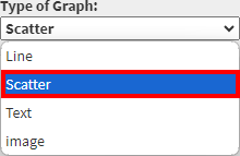
Click on the Type of Graph field and select the Line option.
Advanced Settings
Advanced Settings can be used to make more refined changes to the Graph.
Click on the Advanced Settings panel.
The Advanced Settings panel will expand.
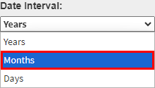
Date Interval
Date Intervals break down and display data over specific periods for clearer visualisation and comparison.
Click on the Date Interval drop-down menu to select an appropriate option for the Graph.
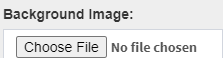
Background Image
You are able to upload an external image as a template or reference for the Scatter Graph. This is particularly useful when visualising data against a predefined graph, such as medical charts, anatomical diagrams, or custom grid layouts.
Click on the Choose File button to upload an external file.
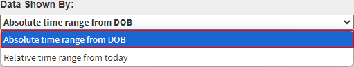
Data Shown By
The Data shown by the field allows Users to customise their data view for different purposes.
Click on the Data Shown By drop-down menu to select an appropriate option for the Graph.
Absolute Time Range from DOB:Provides a comprehensive look at long-term trends from the Patient's birth to the present, which is ideal for analysing historical health patterns.
Relative Time Range from Today: Focuses on recent data from the day the graph was created, making it useful for monitoring short-term changes and current conditions.
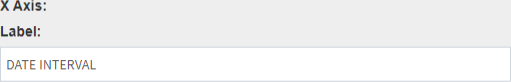
X-Axis
The X-Axis in a line graph represents the independent variable, typically time or another sequential factor. Its purpose is to provide a reference for plotting data points along a continuum, allowing Users to visualize trends, patterns and changes over the specified intervals. By displaying data along the X-Axis, Users can easily track progress, compare different periods, and analyze the relationship between the data set and time or other sequential factors.
Click on the Label field to enter a name for the Axis.
Click on the Minimum field to enter the desired information.
Click on the Maximum field to enter the desired information.
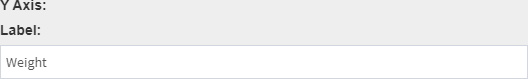
Y-Axis
The Y-Axis in a line graph represents the dependent variable, which is the data being measured or observed, such as a Patient's vital signs or lab results. Its purpose is to display the range of values or quantities associated with the data points plotted on the graph.
Click on the Label field to enter a name for the Axis.
Click on the Minimum field to enter the desired information.
Click on the Maximum field to enter the desired information.
Widget Visible Patient Age Range
Specifies the Minimum and Maximum Age Range that will be used to set up the Graph.
Click on the Minimum field to enter the desired Minimum Age.
Click on the Maximum field to enter the desired Maximum Age.
?Please Note: If an Age Range does not apply to the Template used, entering information into these fields is unnecessary.
Graphs
Graphs visually present data, making identifying patterns, trends, and relationships easier.
Click on the Add+ button.
The Add Line field will open.
?Please Note: Additional lines can be added by Clicking on the Add+ button.
Click on the Name field to Add a Name for the Line.
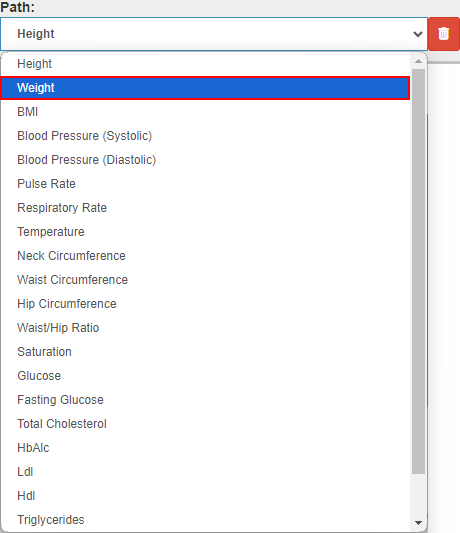
Click on the Path drop-down menu to select the desired option for the Line.
Click on the Delete button to Delete a Line.
Click on the Ok button to Create the Graph.
The Graph will be Added to the Patient Dashboard.
Click on the Save button to save changes made.
Last modified: Friday, 13 September 2024, 12:32 PM