Why This Matters?

The Scatter Graph displays patient data as individual points on a graph, making it easier to compare information and see how different values relate to each other.

This gives the practitioner a clear visual overview of the patient's data, making trends, changes, and unusual results easier to spot. It can be particularly useful when monitoring information over time or comparing different clinical measurements, helping the practitioner better understand the patient's information and make more informed clinical decisions.

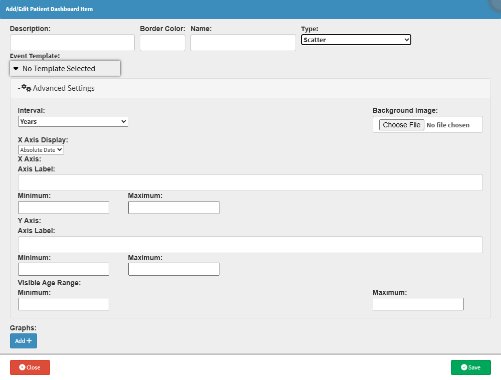
  • Start on the Add/Edit Patient Dashboard Item screen.
Sections

  • Interval
  • Background Image
  • X-Axis Display
  • X-Axis
  • Y-Axis
  • Visible Age Range

Interval

  • Years: Defines the interval in years.
  • Months: Defines the interval in months.
  • Days: Defines the interval in days.

Background Image


  • Choose File: Upload external images as a template or reference for the Scatter Graph.

X-Axis Display


  • Absolute Date: Specific calendar dates displayed chronologically.
  • Patient Age: The patient's age at each recorded data point.

X-Axis


  • Axis Label: Custom label displayed along the horizontal (X) axis.
  • Minimum: Starting value for the X-axis. 
  • Maximum: End value for the X-axis. 

Y-Axis


  • Axis Label: Custom label displayed along the vertical (Y) axis.
  • Minimum: Starting value for the Y-axis. 
  • Maximum: End value for the Y-axis. 

Visible Age Range


  • Minimum: Starting age used in the graph.
  • Maximum: End age used in the graph.

💡Please Note: If the template doesn't use an age range, you don't need to fill in these fields.

Last modified: Tuesday, 27 October 2026, 1:01 PM