* Glossary Roadmap Legend
The legend to read each glossary item is on an expandable tab. With the click of a button, it is possible to open up the glossary roadmap legend
Glossary Roadmap Legend Button

Legend

There are different shortcuts that have different meanings in each of these legends, the glossary legend consists of items and actions.
Below is an explanation of each legend with an example in both the Web App as well as the Desktop App.
Items
These are all items in the glossary legend:
1. MOD - Module
Modules are only available in Desktop App although we speak of Modules in the Web App these Modules are accessed from a different point.
A Module is a section of the program to focuses only on one area of the functionality of the software program, for example, the Financial system has its own Module and the Stock system has its own Module.
Example: Desktop App Navigator indicates all the modules available on the Desktop App.


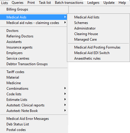
The Menu bar is used in the Desktop App.
A menu bar is an element that contains sub-menus.
The menu bar's purpose is to supply a list of specific menus which provide access to different functions.

Menus are available in the Desktop App.
A menu is a list of options presented to the user of the functions available in the system.

By clicking on any of these menus, a new sub-menu will open.
5. SM - Sub-Menu
6. NB - Navigation bar
The Navigation Bar is used in the Web App.
A navigation bar is a bar located at the top of a page.
It is used to navigate users to other screens in the system.


Example:

9. T - Tab(s) are available on the Desktop and Web App.
When clicked, the contents of the tab will open and display the window's screen/interface, which is a clickable area at the top of the window.

Example: Diary, Debtors, Reports, Tasks etc. are all examples of Tabs in the Web App on the navigation bar.

Example: General, Medical/Paramedic, Diary, Diary view and Miscellaneous are Tabs in the Desktop App, user preferences screen.
10. ST - Sub Tab
Sub Tabs is used in the Web App.
A sub-tab is a clickable area that is part of a larger screen/interface. When clicked, the contents of the sub-tab will open and display those functions.

In some cases, the screen that opens up will not have any functions but will only open for display purposes.
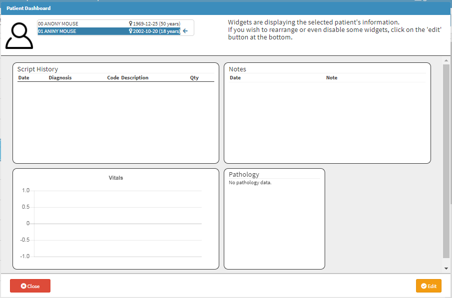
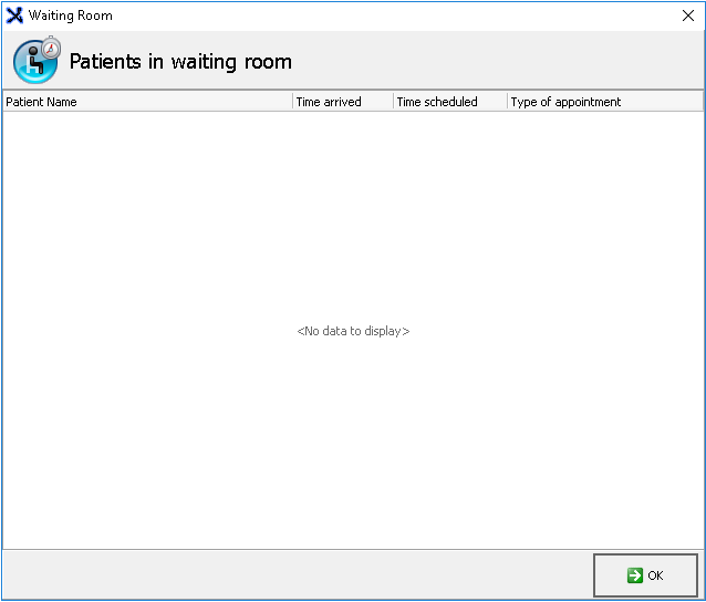
12. SB = Sidebar
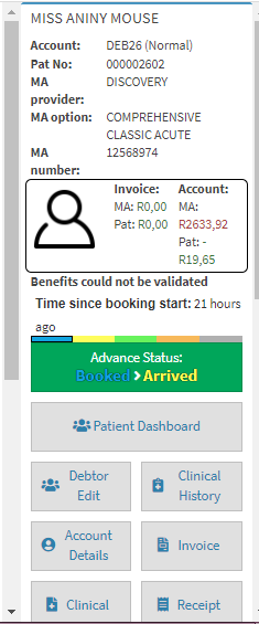
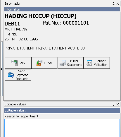

14. SP - Sub Panel

15. PU - Pop-up
A Pop-up is a small screen that will pop-up once a certain function is done. Some of these Pop-ups will indicate a warning, to warn the user that a certain action will now take place. A Pop-up can also be just informative containing a message indicating that the action was done successfully.
Web App:

Desktop App:

16. B - Button
A Button is an element that makes it possible for users to interact with the system when they click on it.
When the user clicks on a button in the system it will open a new window with that buttons function/information.
Web App:

Example: The new debtor button will open a new screen where you can add a new debtor to the system.
Desktop App:
Example: When clicking on the exit button the screen will close.

18. DM - Drop menu
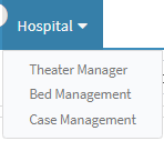
Example: When clicking on the Hospital Tab, a drop-down menu will open up.
Desktop App:

Example: When clicking on the arrow of the Type of ID a drop-down will open up with a list of options that you can choose from.

Example: You can find fields that are mandatory, non-mandatory, and search fields. The example on both the Web App and Desktop App shows fields that are mandatory as indicated by a red asterisk.
Desktop App:

Example of a Search field: 
A Checkbox is a little square that is clickable on a screen, which indicates that a certain selection can be made.
Take Note: Where checkboxes are available more than one selection can be made simultaneously.
Web App:

Desktop App:

Actions
These are all actions in the glossary legend:
16. > = Click
The > sign indicates that you have to click once on the function mentioned in the roadmap in order to proceed to the new function.
The >> sign indicates that you have to quickly click twice on the function mentioned in the roadmap in order to proceed to the new function, screen or before any result will be shown.
The * (asterisk) sign indicates that you have to use the right-click function on the mouse in order to open up a new menu, list or screen.
The <- (reverse arrow) indicates that you have to press the Enter key on the keyboard to go to the new function, open up a new screen or make a selection.
The -> (forward arrow) indicates that you have to press the Tab key on the keyboard to move onto the next field or function. In some instances, the tab will open up a new screen as well.
The - (dash/minus sign) indicates that this is the result at the end of the roadmap, this will indicate the desired end result.